nyma
ambient intelligence –
interactive room installation
— Siegbert A. Warwitz
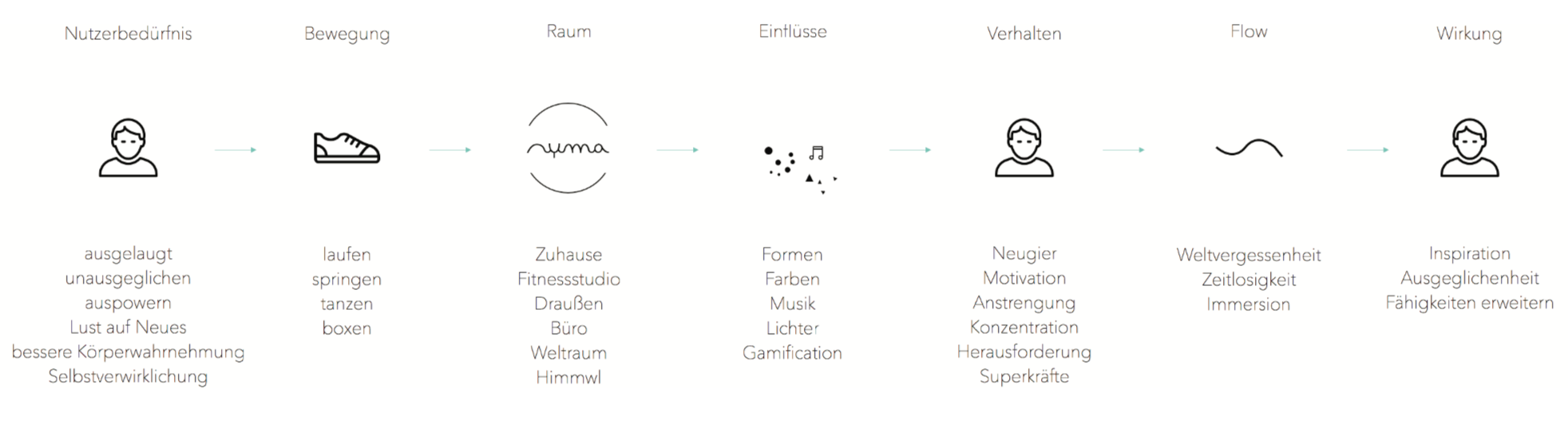
nyma was realised during the sixth semester as a main semester project. In this year, we were pursuing the topic ambient intelligence. The flow state is a mental state where people are totally focused, completely deepening while doing an activity which takes place almost by itself. In the following case, users are having an immerse experience by doing focused movements.
An advantage of a room installation is the completely immersion and intensive experience by being surrounded and isolated. The user is free from external influences and in the focus. nyma is an intelligent system which is based on detecting and interpreting movements. It reflects movements, manipulates and adapts to the user to let him create an individual world, in which he can totally unfold himself.
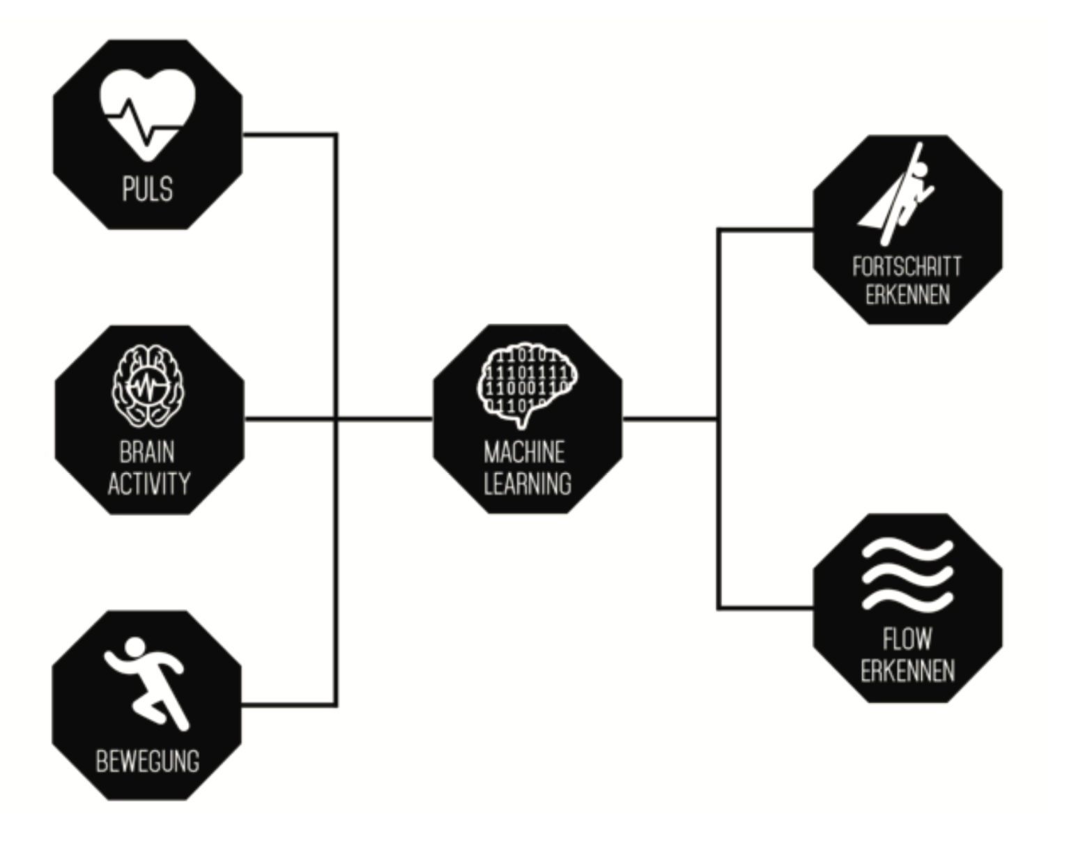
While being in the flow state, skills can be subconsciously trained which wouldn't be possible to acquire consciously. Also, movements can be perceived more intense to perfect them and create a status of total productivity. nyma is a counterpart, who helps the user to get the right challenges and friend at the same time who is overcoming hurdles together with the user. If he is on the right track and the movement level matches and adapts his level of abilities, he is able to get into the flow. With nyma the user is creating his own immerse experience.
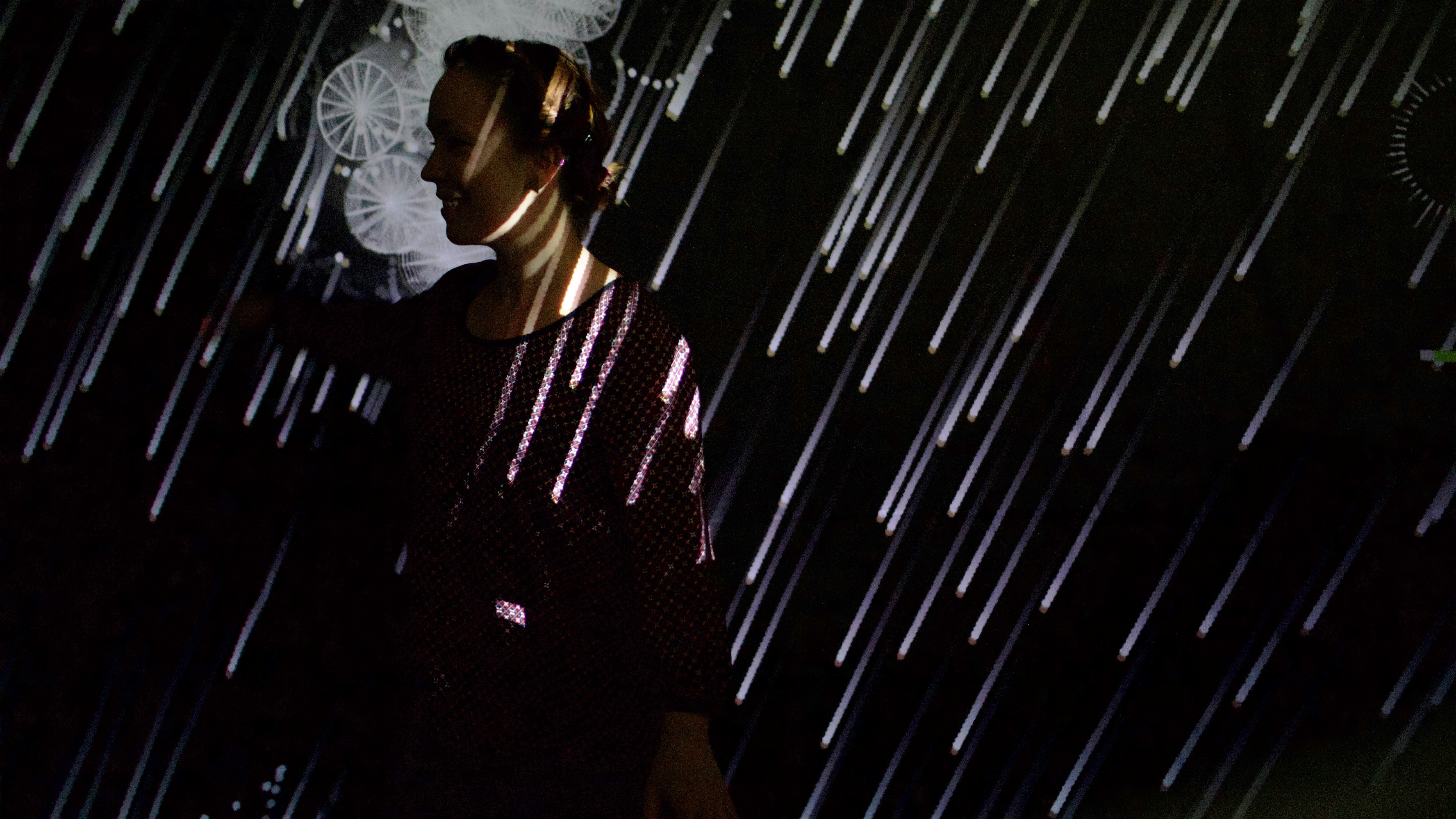
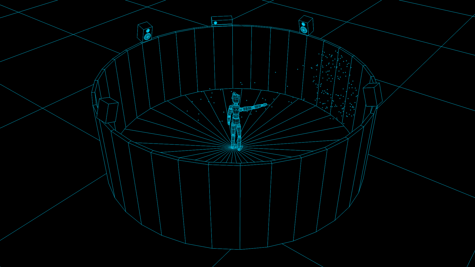
nyma is an intelligent system based on data acquisition, motion recording, vital data and brain wave measurement. This data is used to create an individual and customized world for the user. In order to make the experience as real and immersive as possible, the users are completely isolated from disturbing factors. With nyma, all walls represent a uniform surface, so that a 360° projection surface exists and the floor and ceiling are also included. At the same time, the room is surrounded by a loudspeaker system that creates a surround effect. On the basis of all these influencing factors, nyma can further develop itself as a system and assess the user better.
![]()
For more information, the interactive documentation can be found on the following link: http://www.sellestadt.de/hda/nymadoc017i/.
ideation
conception
realisation: logo, vvvv (audio)
Alexander Henker
Ivan Iovine
Nadine Mlakar
Lukas Rabenau
Marius Müller
Doreen Scheller
2016